If you’ve looked at your website builder lately, you might have noticed a few new additions.
That’s because we recently went live in the Facebook group to talk about the what, why, and how of our redesigned website and branding as well as give you the tools to do it too (new features!). If you didn't get to attend the event, you can watch it below.
Here's a quick summary of what we talked about:
- We brought a bolder, more masculine look to Simplero to balance out our very developed feminine qualities
- We released new features for the website builder:
- Split hero
- Floating icons
- Commitments
- Numbers
- Features split
- In 2019, we're becoming certified with StoryBrand to help you clarify your message so customers will listen.
Keep reading for a full overview! (6 min read)
The Bold and the Beautiful
We redesigned our brand and rolled out a new website. Maybe you noticed?
While the old logo and look was dearly loved, we saw a problem. It was out of balance.
To take Simplero to the next level; to become a player in the world wide market, we needed something stronger. Bolder.
Something that commanded the respect and attenton we deserve.
If this all sounds masculine, that’s by design. The old Simplero, while beautiful and dearly loved, was mostly feminine and almost completely lacked masculine energy.
To read more on the thinking behind this, read this post from our founder, Calvin Correli.
Simplero is poised to grow - significantly. To reach our full potential, we needed to change. This was the first step and we’ll continue to change and evolve as we grow. But we also want your feedback.
We’ve made it easy with a little red “Feedback” button on the right side of the website. If you love (or hate) something about the new website, let us know using that button.

Pro tip, click the little square in the corner to select the specific part of the website you’re talking about.
Did somebody say new features?
To help us fully realize our vision we developed a few new features for the website builder. After testing and refining them for ourselves, we’ve now made them available for you to use in your own websites.
Lets take a look look at each one.
Split hero
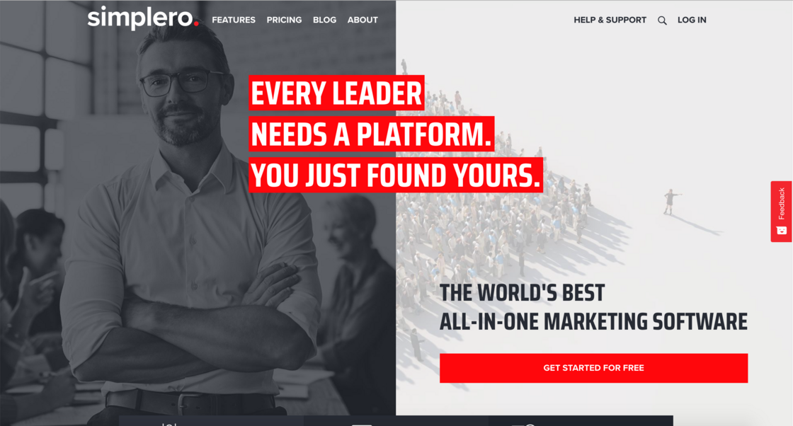
This one got the most attention and it’s easy to see why. It stands out. Websites have always and forever only had one header.
Sure, some people have rotating images as their header, but data shows those aren’t effective anymore (see here, here, and here).
Maybe you could do a video, but most small businesses don’t have a pro video to place as their hero image.
So what do you to stand out? Use a split hero.
That's what Simplero user Brian Stahlhut Christiansen did within hours of the new features being released:
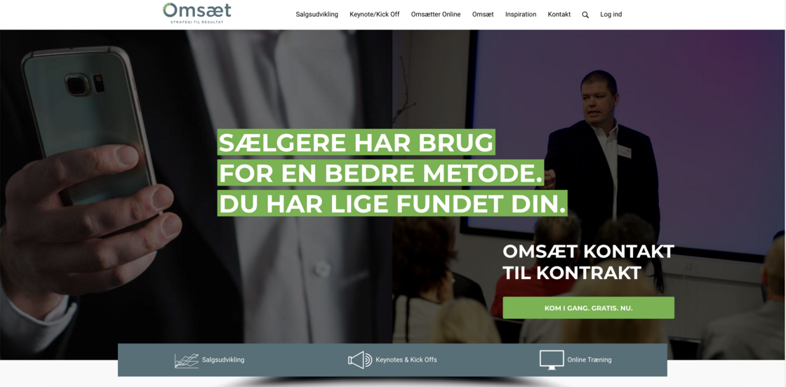
Link to website: Hjem - Omsæt
Looks awesome Brian 👍
Floating Icons
To add some more pizzazz to your header, we also added a section called "Floating Icons".
![]()
While it looks nice, it also serves an important function - to simply your offering into bite-sized chunks. This is a critical part of something called the StoryBrand framework which we'll talk more about later.
Use this section to simplify what you do and make it easier for your customer to understand your business and why they need your service or product.
Commitments
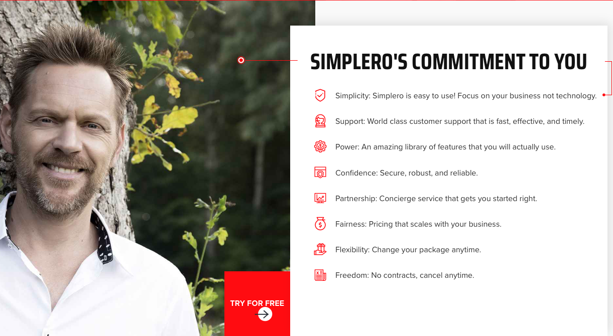
According to acclaimed author and speaker Simon Sinek, people don't buy what you do, they buy why you do it. We wanted a simple, clear, and beautiful way to show our customers what matters most to us and what we're committed to as a product and company.
This helps visitors understand our values - simplicity, fairness, and flexibility to name a few. And it works. In fact, one of our users have this to say when they saw this section:
"Crystal clear. Quickly highlights everything I need to know, with no fluff. Inspires confidence and ignites desire."
Couldn't have said it better.
Numbers
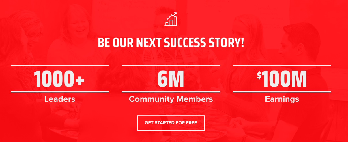
Everybody loves a good statistic (a form of social proof), but most of the time they're boring and uninspiring. We wanted to change that.
With the new Numbers section, you can display as many stats as you'd like and they'll be formatted in a bold, powerful way that's easy for a first time visitor to understand. You can customize the text, color, background image, and even add a call-to-action button that makes it easy for visitors to engage.
Use this to show your customers that you mean business and that you have the data to back it up.
Features Split
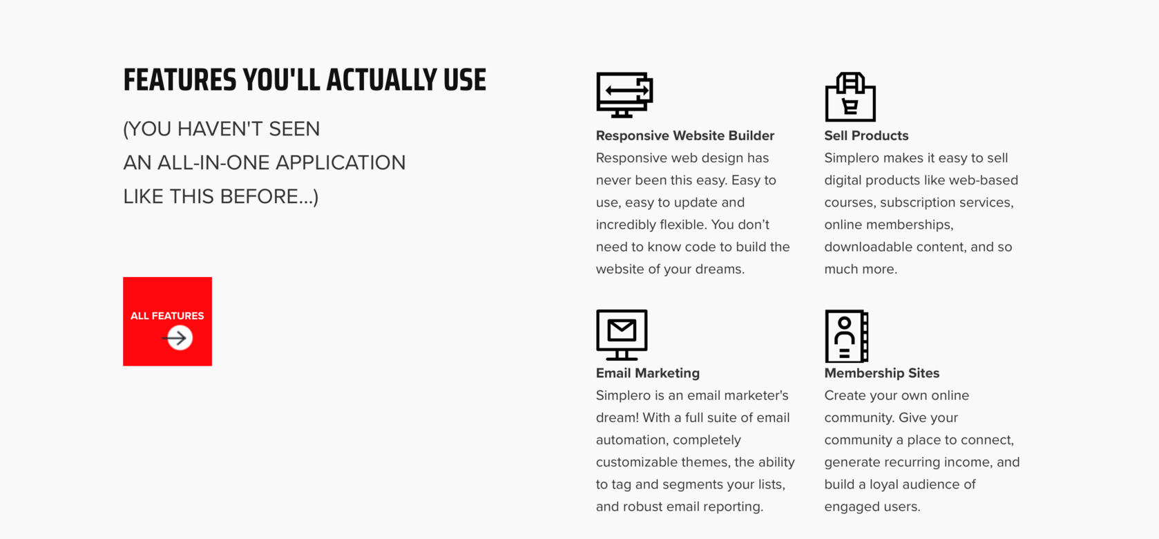
Like most businesses, we have a lot of features and benefits to offer customers. The challenge is how to display that information in a fun and visually dynamic way that stands out. To help us accomplish that, we created the Features Split section.
This section is split (ha) into two parts: the main overview and the features list.
- In the main overview section on the left, you can write a header, paragraph text, and add a button just like any other text section.
- On the right is where your list of features are displayed. Add a photo, a header, and description text all in the website builder panel.
If you're looking for an interesting way to showcase your features, or really anything, this section was made for you.
Using story to clarify our message (and yours)
When we sat down to plan out the vision of the new website, we knew we were lacking in one main area.
Clarity.
The possibilities with Simplero are so broad and so massive, it was difficult to decide where to even begin with our message. How do you clearly communicate something that can do so much?
Maybe you've dealt with something similar in your own business. The challenge of knowing what to say and how to say it has always plagued business owners, but with the dawn of the digital age and the sheer amount of information we're exposed to everyday, it's more critical than ever that we're clear and powerful in what we say.
That's where StoryBrand comes in.

StoryBrand teaches businesses how to clarify their message using the elements of story. Using 2000 year-old narrative formulas, you learn how to frame your marketing in a way that the human brain is wired to understand and engage with.
We decided to use the StoryBrand framework in our own marketing and we've been amazed at how much clearer and compelling our messaging is. But even more amazing is how much it brought us together internally. We're crystal clear on where we're going as a company and what we're here to do.
And we want the same for you.
In 2019, Simplero is getting certified to teach the StoryBrand framework to its customers.
Very soon, you'll be able to work with a StoryBrand Certified Guide at Simplero to clarify your message and learn how to communicate more powerfully in your marketing.
We're more than a software company. We're here to help you grow your business and get the results you want. Offering StoryBrand services to you, our amazing customers, is only logical after experiencing firsthand the impact it had at Simplero. We're excited for what this is going to do for your businesses.
What were your favorite announcements? Comment below so we can hear from you!
If you have questions, reach out to our incredible support team at support@simplero.com
Comments