Thoughts on a Simplero Rebrand
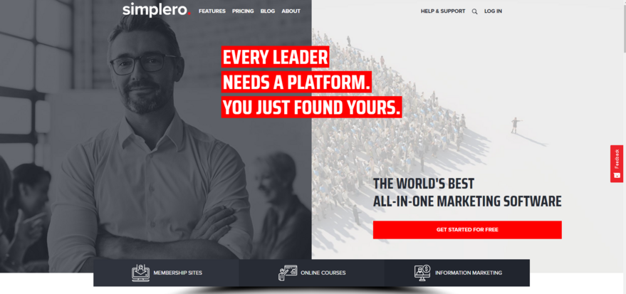
If you’ve been to simplero.com recently, you’ve probably noticed that it looks quite different.
To say that we’re all really excited about the new website would be an understatement. Let me explain why.
Not only is simplero.com now a proper Simplero website, built using the same website builder that most of you use and love. That means that anyone on our team can easily edit any page on the site, which will make it much easier to keep the site up to date as we add new features and experiment with new marketing ideas.
It also means we’re eating our own dogfood, as they say, which has led us to add some new features to the site builder, as we’re wont to do. We’ll also be releasing some new sections that we built that we think you’re going to find super valuable as well, for some very specific reasons. More on that later.
But even more than that, the new website is the outward manifestation of a bold new direction for the company, a change that started almost a year ago.
If I were to summarize the new direction in a single word, that word would be: Masculine.
Simplero was always founded on very feminine values. I liked to say it was your home on the internet. Our logo was a cursive Simplero with a sprouting tree. Our brand colors were coral and green. We cared deeply for serving and connecting with our customers. We talked a lot about intuition and following the flow. Indeed, we built the company and the product in a very feminine way, having a deep soul, clear values, and a powerful vision, but letting the day-to-day be dictated by what happened to be in front of us that day.
None of that is bad, and none of that is going away.
But Simplero was very lopsided. All feminine, no masculine. That’s not healthy for a human, or a relationship, and it’s certainly not healthy for a company. Simplero needed a healthy dose of masculine. So that’s what I set out to do.
We started out internally. We got much more clear about roles and responsibilities, expectations and goals. We got ourselves a marketing department for the first time. We started being much more structured about all of our processes, from hiring, to development, to compensation. We’ve grown four-fold this year, from 4 to 16 people. We’ve gotten a lot more clear about where we’re going, and what exact steps we’re taking to get there.
With the website and branding, we wanted to go all-in on the masculine. Red, white, and black. Not toned down, pastel colors, but full-on bold colors. The copy is direct and to the point. There’s a purpose and a reason behind every single element on that site. The lines are sharp and clear and bold.
We’re not forgetting the feminine side. For one thing, the majority of our team is still female. But when you’re looking to correct an imbalance, the most effective strategy is to overcorrect in the opposite direction, until you get super comfortable with the new. Then you’ll naturally find the equilibrium that’s right for you.
We’ve gotten feedback that the new website is so masculine it turns them away. In fact, that’s exactly what we were going for. The fierceness of a powerful masculine energy can be jarring, perhaps even triggering to some. That’s okay. It is a dramatic change.
But keep in mind all of the aspects of the masculine that we sometimes forget these days.
The healthy mature masculine provides and protects. It braves the fire to save the women and children. It holds the door, helps carry the shopping bags, fixes the broken window, and picks up the trash from your home. The masculine will fiercely protect its loved ones in the face of fear. The masculine knows where to go and gets you there.
We’re going for a massive dollop of healthy mature masculine in Simplero, and we couldn’t be more excited about going on this journey with you.
18 comments
Thanks for this wonderful explanation of the changes. I appreciate the clarity about Healthy balance and your leadership. It was unexpected to read, and so glad that you're putting this energy out into the world- that so needs it. I look forward to this journey with Simplero. !
Thank you so much, Stacey! Excited for this journey. Just spent a week in Arizona with the marketing team, and we're having so much fun with all of it.
What a great change and wooww that such a great website can be done in Simplero. You and your team are really eating your own dogfood:-) and are 110 miles in front of others in this business. Some questions came to my mind and that is; The website hosting is it within my simplero account? - what happen to my SEO and my rank in google searching ( I am already high ranked when you search of my keywords). I am so happy for my Simplero and your support which is outstanding.
Absolutely, website hosting is included. Just go to "Site" in your Simplero account admin interface. You can also use your existing domain with it. Not sure about the SEO effects, but you can import your blog from Wordpress site, and you can set up redirects for any other page. Try asking in our Facebook group about the SEO implications. Kasim can probably weigh in there as well.
Love this post....my feedback was going to be....errr....Calvin......it's very masculine..... and then ha ha ha I read this post - that was the aim all along so you achieved it! I personally preferred the old look and style, but I guess that's because I'm a girl. I like the fact simplero wasn't all male-internet-markety (god knows there's enough of those platforms out there) and here's hoping you keep the balance - and so glad that we get to brand the site to suit our look and feel. Looking forward to seeing what you do with the website bit as I still haven't moved over from wordpress as yet....
Yeah, we'll see where we land, but for now we wanted to go all-in on the masculine, like I said. We're definitely not forgetting all of our feminine values. They're inextricably part of who we are.
Calvin. I love it! I love that you are showing us how to use the power of simplero for ALL our work and how to remind ourselves to balance. Congratulations!
Thank you, Dolores!
Where else in the world do you get this type of blog from a tech company? That is why you rock! It’s the consciousness behind the reasoning that is so powerful.
Thank you, Manjir! I'm humbled by your kind words.
Before it took me one click to go to simplero,com/admin for my site. Now it takes me 3 click. I my opinion it's a setback. Otherwise fine for me whether it's feminine or masculine ...
Thank you, Rikke. We have that on our short-term roadmap to find a good solution to this. This is not intentional, but the default behavior of Simplero sites (which isn't a problem for anyone else). Personally I just start typing the address of my Simplero account in the browser address bar, and it quickly remembers the rest for me. Type "calv" and it says "calvin.simplero.com" right away.
Agree on many of the comments of positive and reassuring nature and also on the on with having to use 3 clicks to get in place...I am quite in the middle myself and always had to do the masculine and the feminine. Wear the boots and the dress so I am fine either way else..
Thank you, Christina. We'll get the login issue fixed.
Love the new look Calvin - powerful and no-nonsense - I much prefer it over the softer look you used before. However I love the warmth of your customer support team - please don't change that - it's the key differentiator over the competition, having real people respond so quickly to requests and provide service always with a warm smile. That's why I stay - your excellent customer service (and products of course)!
The warmth of the support team (and the company in general) isn't going anywhere. Just adding a new dimension that was badly needed.
As someone who works with masculinity/femininity in my business, I love the approach! It's all about finding that yin/yang balance :-)
Totally. Thank you, Laura!
Leave a comment
Please log in or register to post a comment