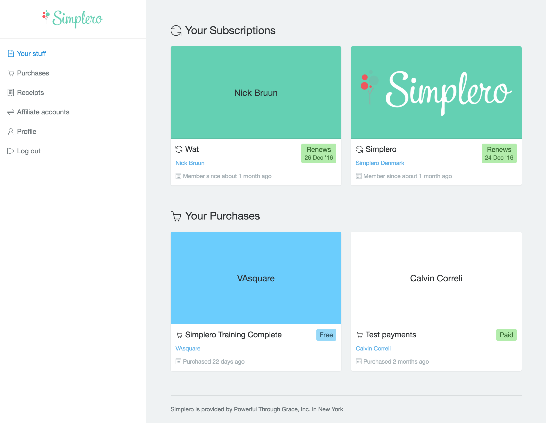
Last week we announced that some pretty major design updates to Simplero were coming your way. We've been hard at work making it all come together, and today we're super excited to release the first in a series of those steps:
Simplero has gotten a new checkout flow and account center:

Actually, there are a lot of other little pages that have gotten an update, like the login screen, payment handling for purchases and so on. You'll notice that the design is quite a departure from what you're used to. The reason for this is, that we're working to make it possible for you to fully customize as much of Simplero as is practically possible.
However, some pages, like the checkout flow and the account center, are simply too complex to make fully customizable while also simultaneously allowing us to add new features to them without worrying about breaking something.
Instead our focus was on making these pages a lot less heavy and a lot less branded, with the primary focus being on the content, and not the chrome around it, so it doesn't distract from your own branding as we move forward on making Simplero more your own.
So, without further ado, why not head over and check out what your account center and your checkout flows look like now? We're super excited to finally release this update, so please do share your feedback with us!
P.S. If you want to make sure your products look great in the new design, do check out the announcement from last week for more details. We're also still working out a few little details here and there, so do expect to see things change somewhat over the next bit of time, although nothing as dramatic as this.
Comments